Ready Training Online (8/2024 - 2/2025)

Situation
As a UX Designer, I was a key member of an experienced Product Design team at Ready Training Online (RTO), a leading SaaS provider specializing in Learning Management Systems for the service industry.
Our mission was to completely reimagine the user experience of RTO’s trainingGrid application, directly affecting 80% of its user base—approximately 800,000 users. This transformation included streamlining workflows, introducing a modern and visually appealing interface, and enhancing usability to engage the predominantly Gen Z audience in their continuous learning journey.
Ready Training (LMS for the service industry), faced a pressing challenge. Their main LMS application had an outdated user experience with obsolete underlying technology and an underdeveloped UX Program. This negatively impacted sales, making a comprehensive redesign imperative. As a Product/UX Designer, I was a key member of a small yet experienced team and played a large part in the redesign effort.
Users
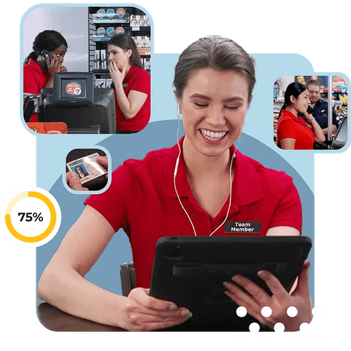
Service Industry “Learners”
The target users of the trainingGrid training dashboard are primarily frontline staff, such as cashiers, servers, cooks, or housekeeping staff, who use trainingGrid to complete compliance and skills-based training relevant to their roles.
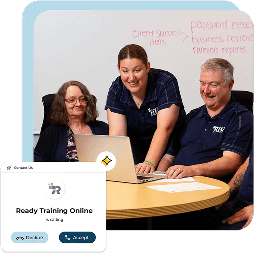
Managers and Supervisors
The target users of the trainingGrid HUBS administration dashboard are store managers, shift supervisors, and department heads who oversee employee training progress, assign training modules, and ensure compliance with regulatory and organizational requirements.
Task
My Role
As one of two Product Designers on the team, responsibilities included designing user flows for key features, contributing substantially to the design system and component library, creating prototypes, and collaborating with the team to brainstorm new concepts. I also contributed to the design and process for user studies and usability testing.
Tools Used
I primarily used Figma for designing, annotating and prototyping both the web and mobile applications. I also used FigJam for design thinking and brainstorming exercises, Adobe for AI image creation and UXTweak for surveys and usability testing.


Action
Research
Gathered requirements from extensive in-house expertise and customer advisory team. Communicated early and often with stakeholders to address the correct product needs.
Initial Findings:
Current platform has solid functionality but it is necessary to overhaul the LMS design and user processes.
Usability Direction: Re-imagine the LMS learning experience with Gen Z focus, to impact 80% of the 900k users. New modern look and feel that feels familiar with popular applications.
Ideation
We re-imagined the Learners Experience:
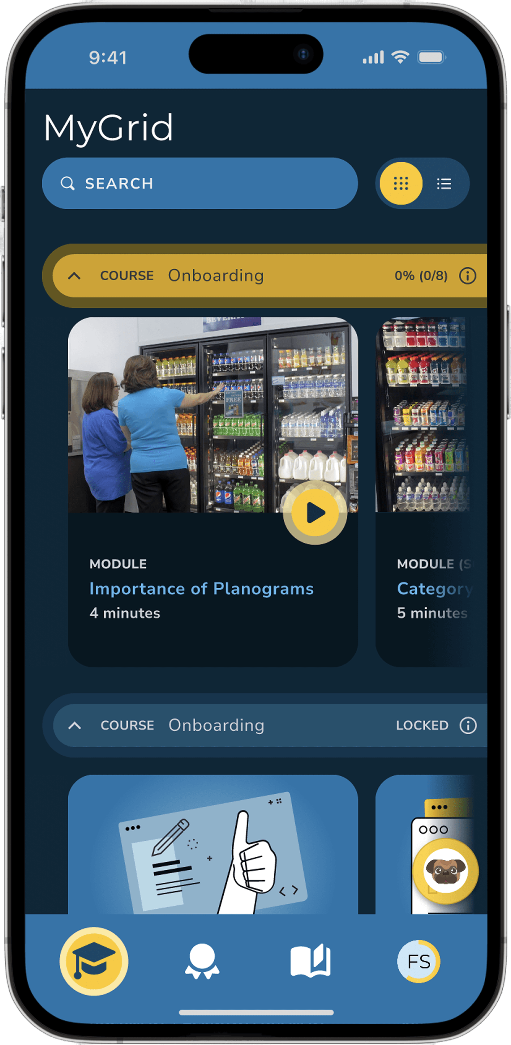
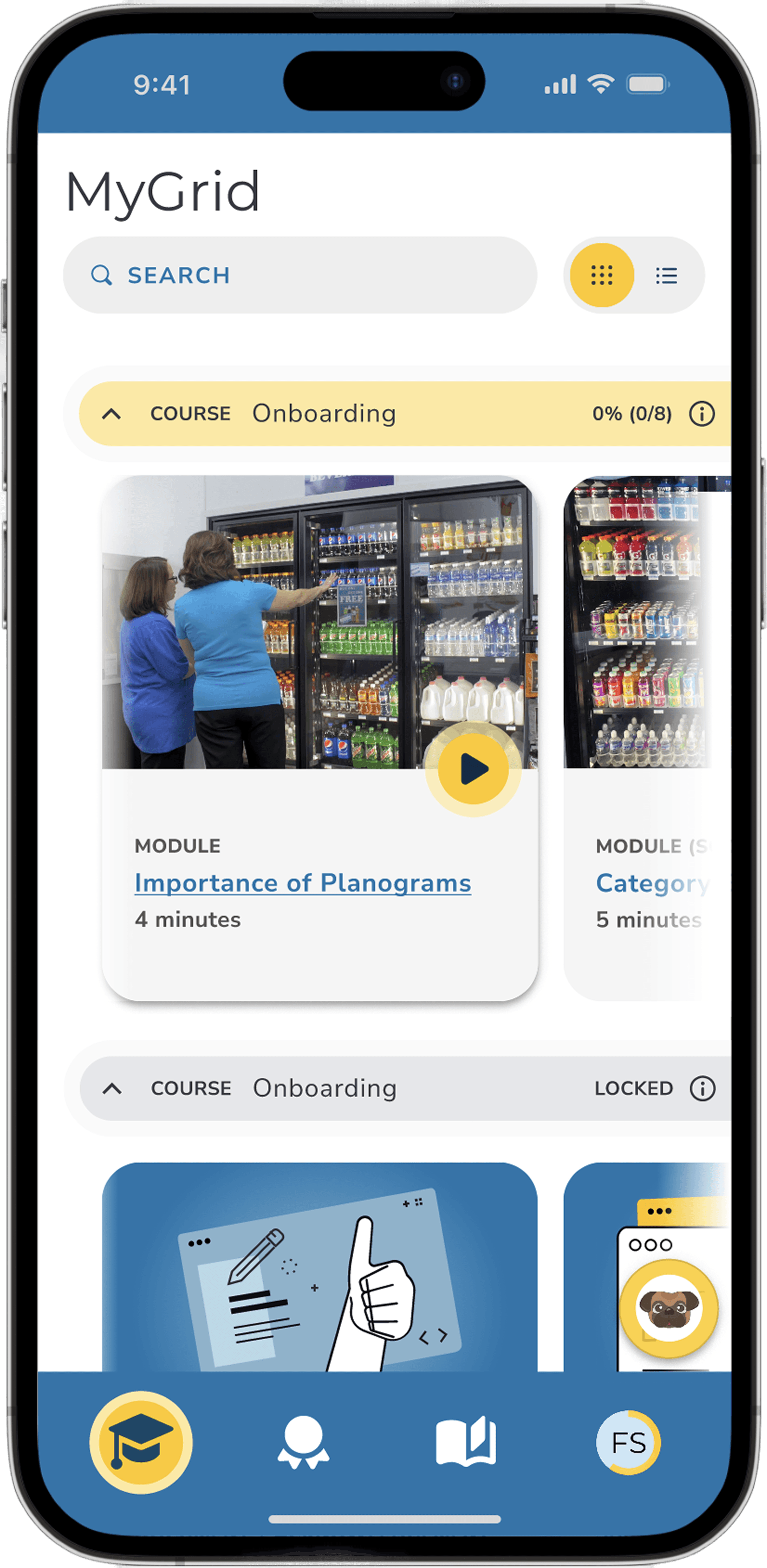
New modern look and feel, added dark mode for Gen Z.
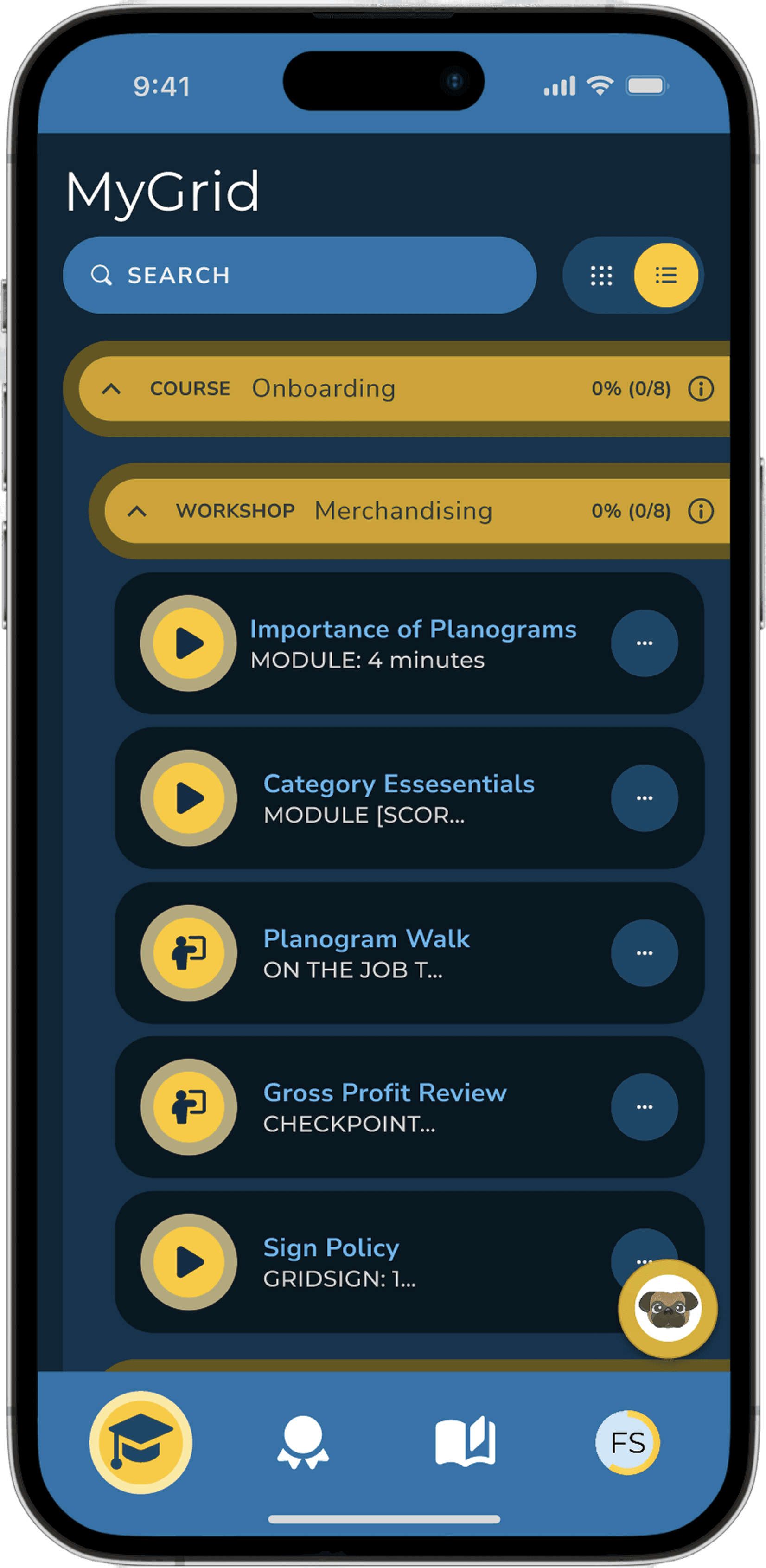
Card (thumbnail) view and list views for flexibility
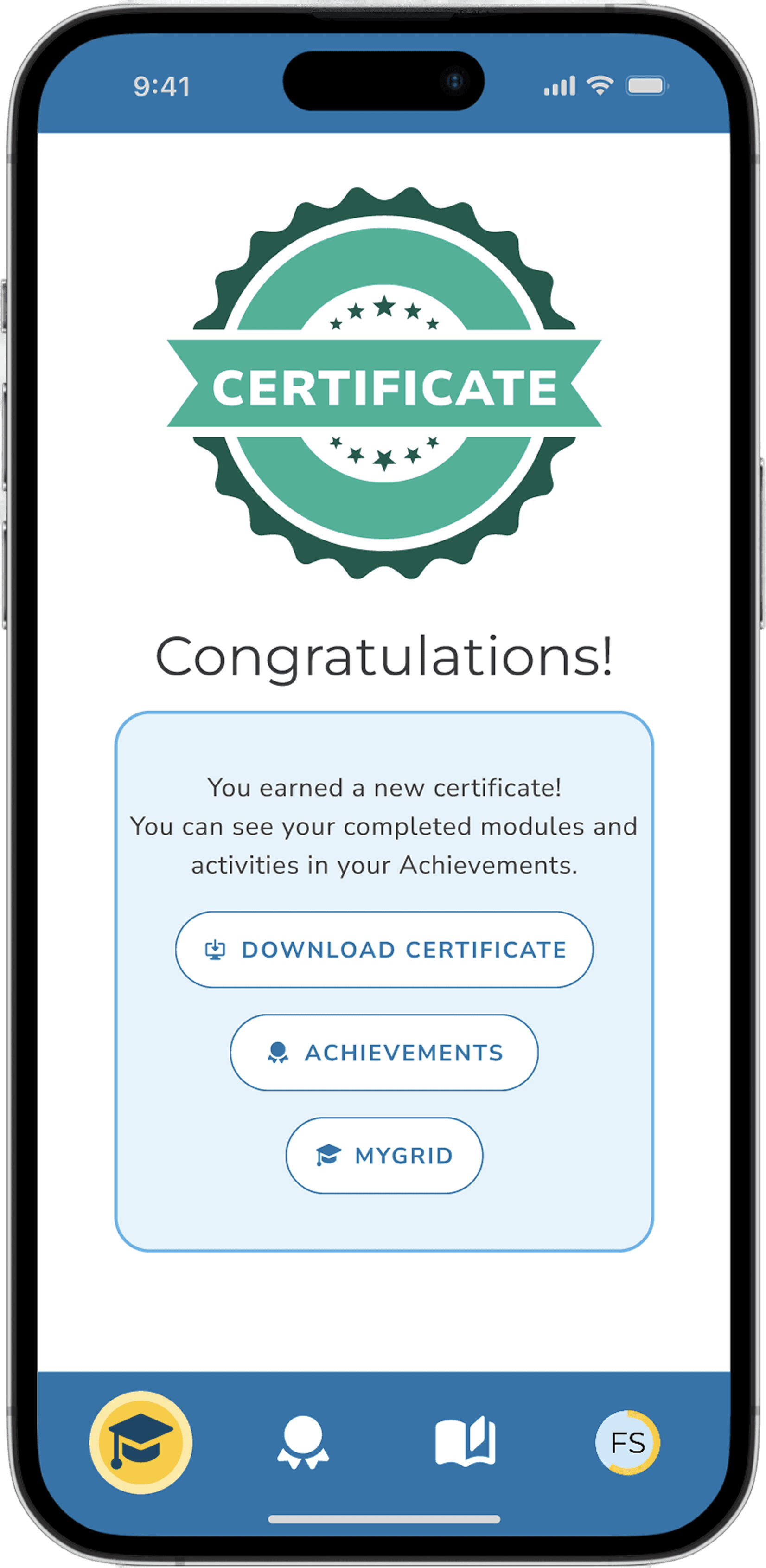
New ”Achievements” feature with certifications
Administration Dashboard to see issues at-a-glance.
Responsive (Desktop/Mobile), Accessible WCAG 2.2 AA
Key Features:
Familiar and modern employee training dashboard makes it smooth for users to find and complete their training. (core functionality)
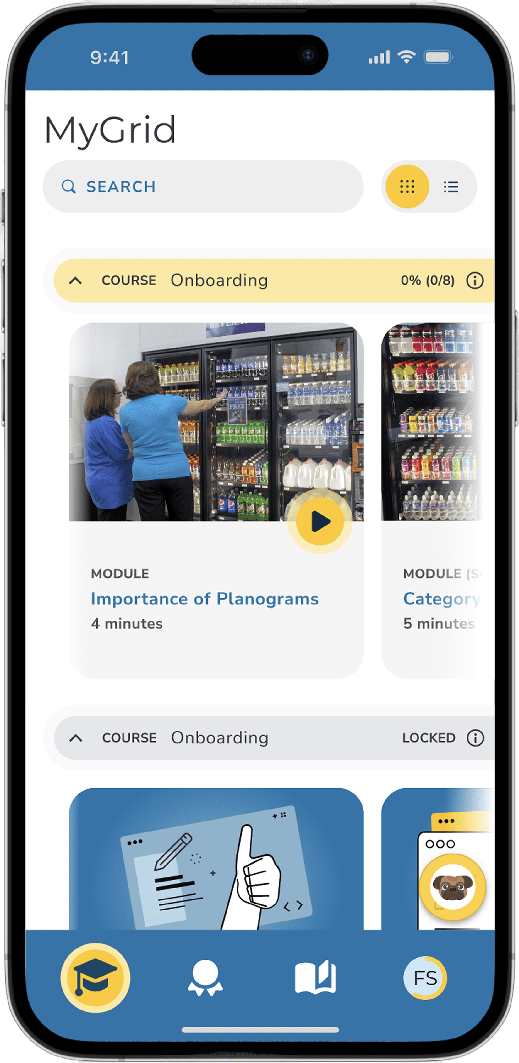
A unified web/mobile experience for consistency across devices, providing more user-access
Card/list views as well as Dark/light modes to enable user personalization
- Gamification/achievements concept with badges and certifications to recognize effort and increase learner motivation/engagement.
Designed several custom Figma components for our design system, ensuring consistent, accessible, and user-friendly interface across the application.
Key components included the application header, left navigation, card components, and buttons.
Figma library streamlined design process, enabling our team to build screens more efficiently and maintain a unified visual language.

Prototype
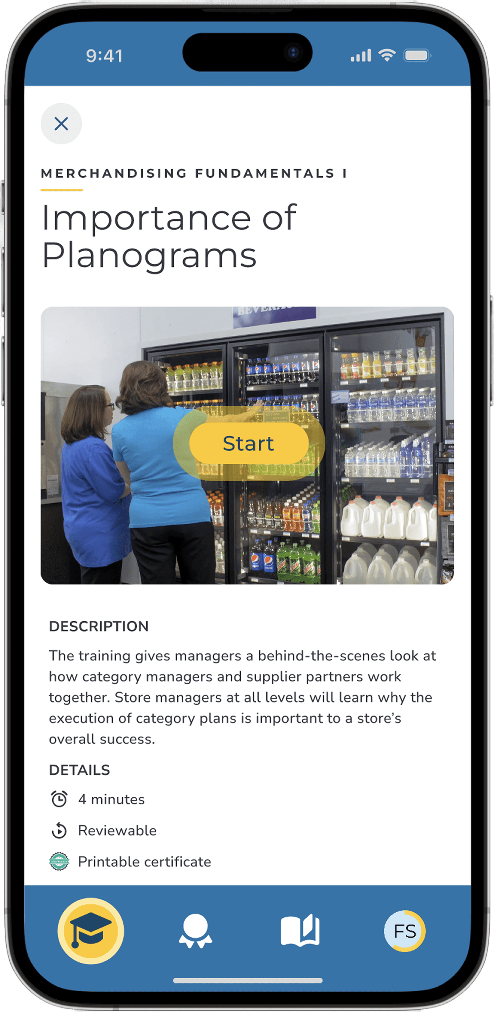
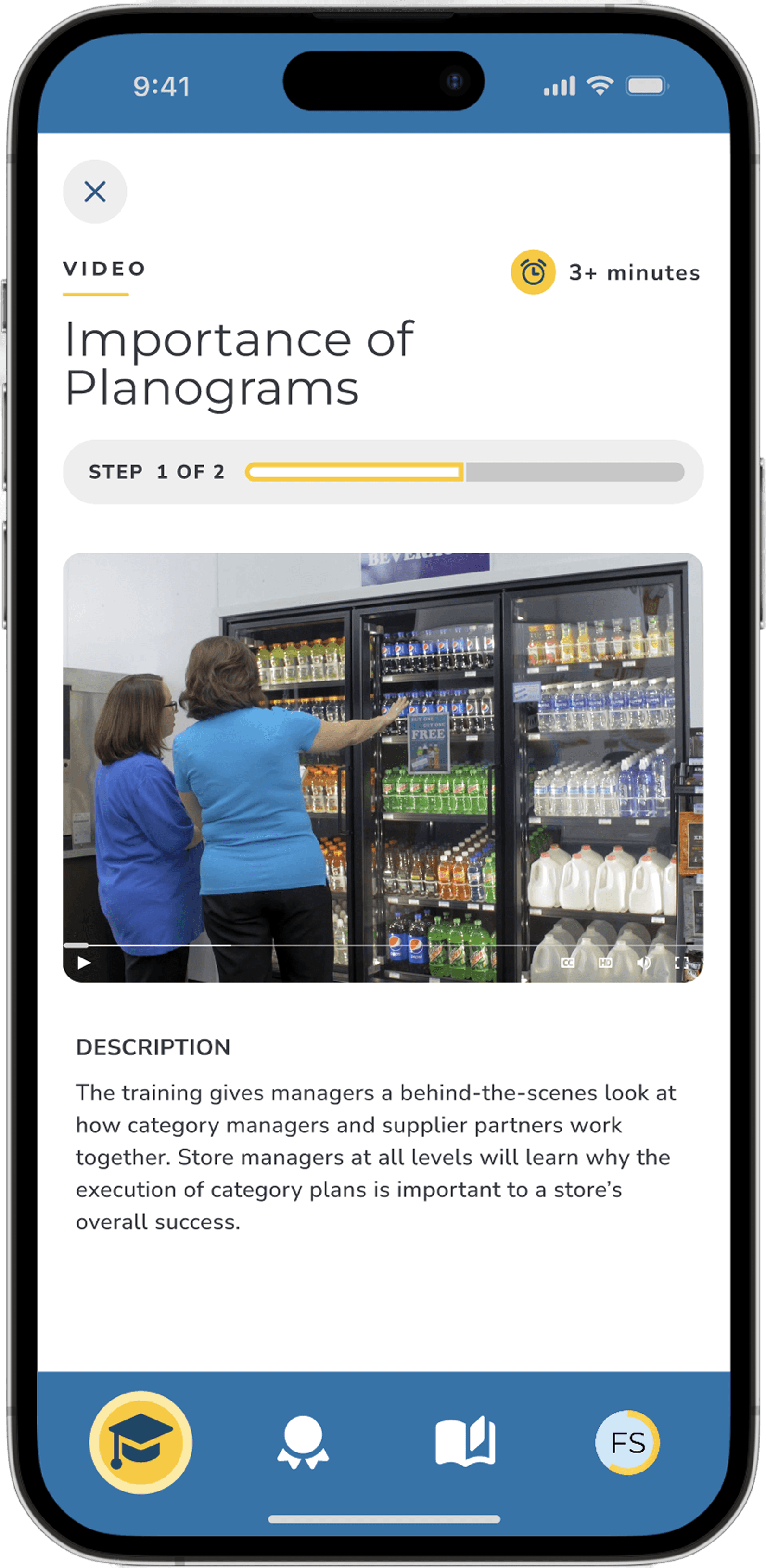
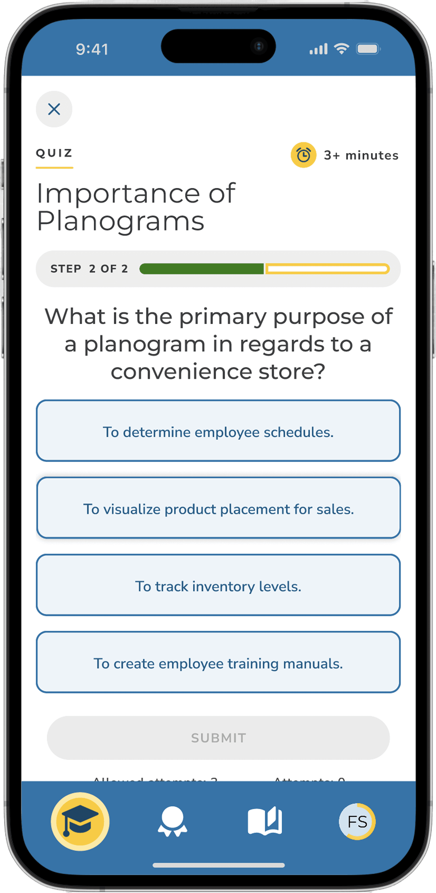
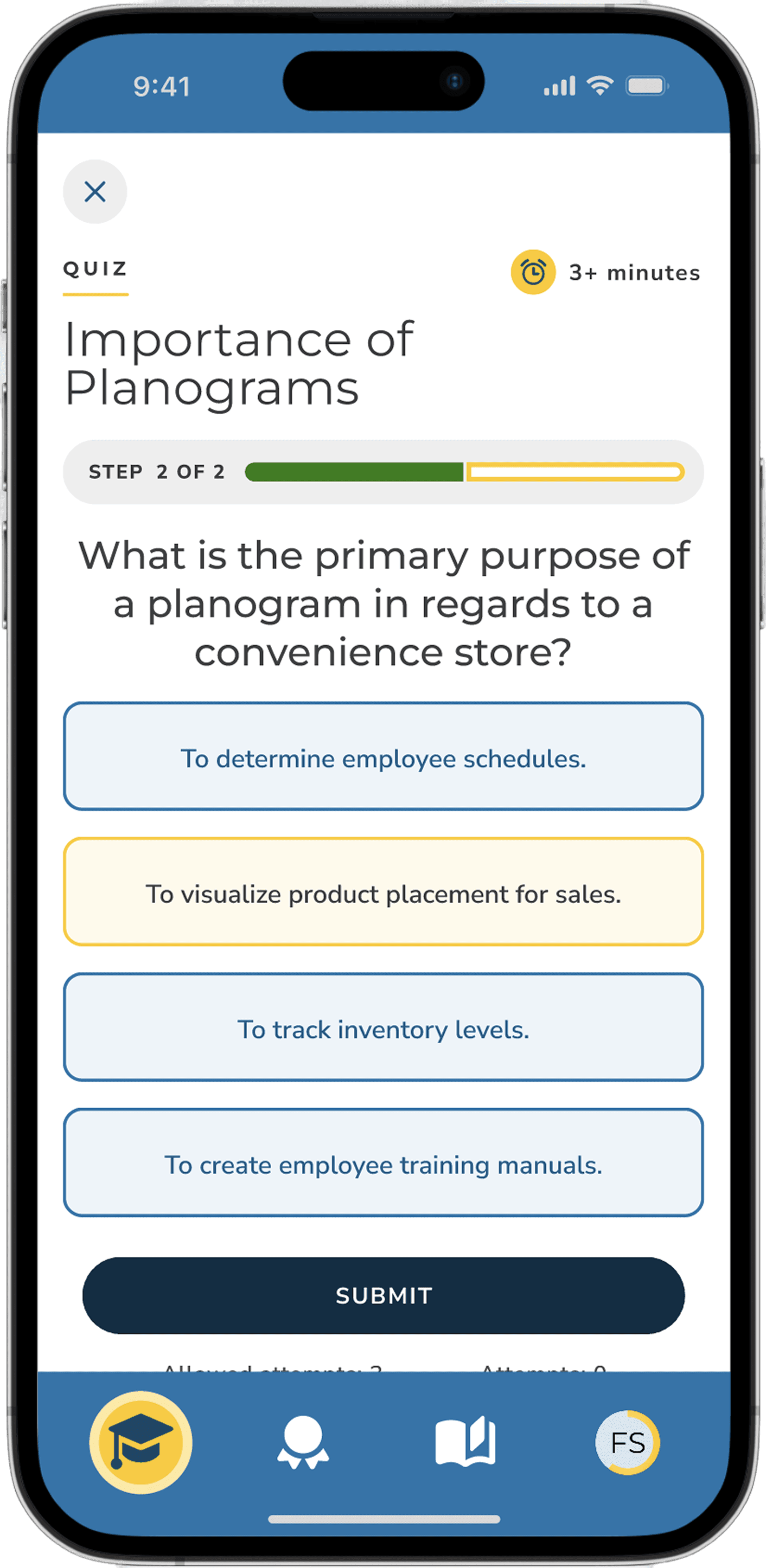
Developed prototypez to showcase the new user flow and dashboard functionality, effectively communicating the improvements to stakeholders. Used to test with active users prior to implementation.
Current Employee Dashboard

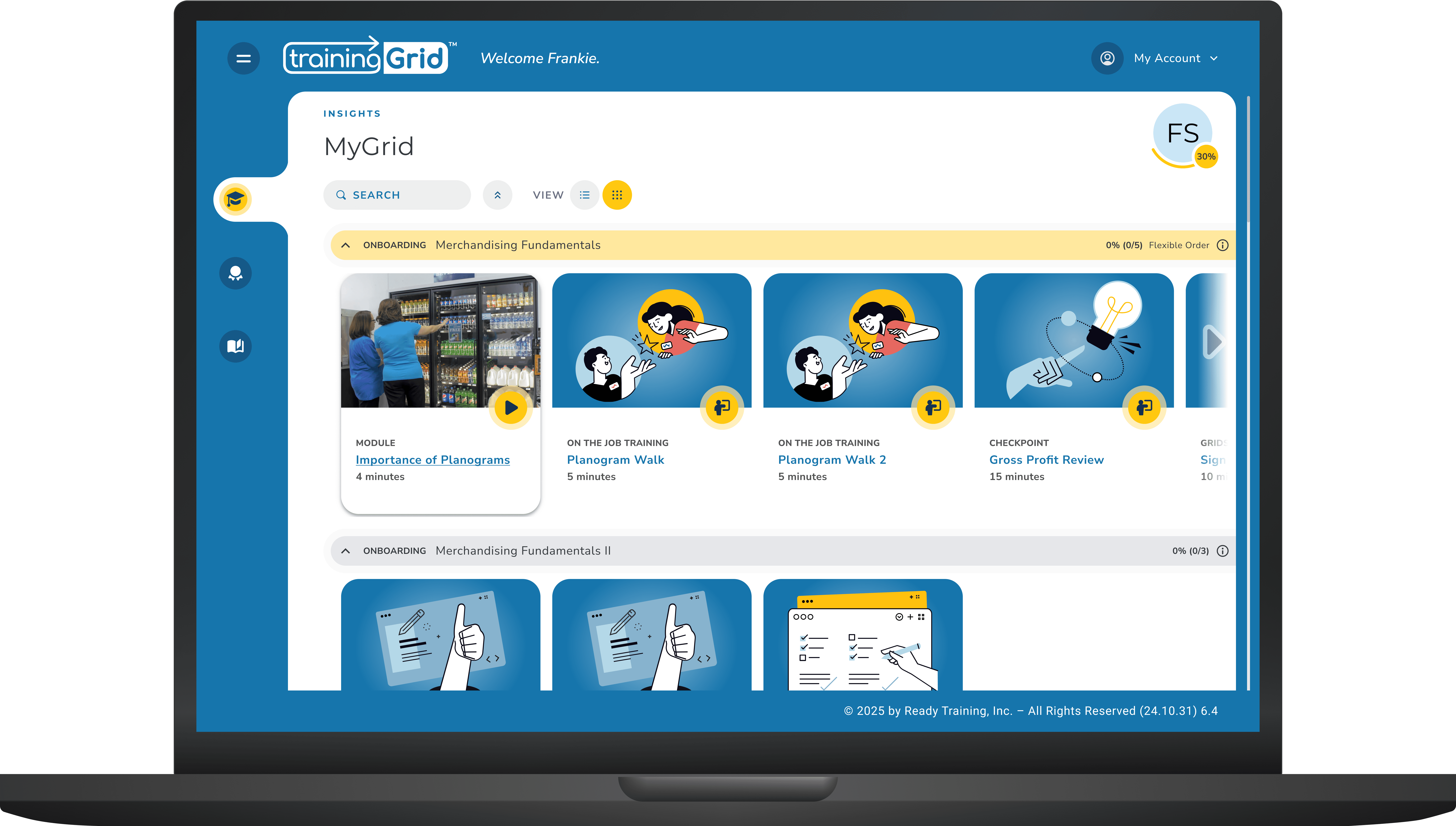
New Design
Result
trainingGrid2 Dashboard
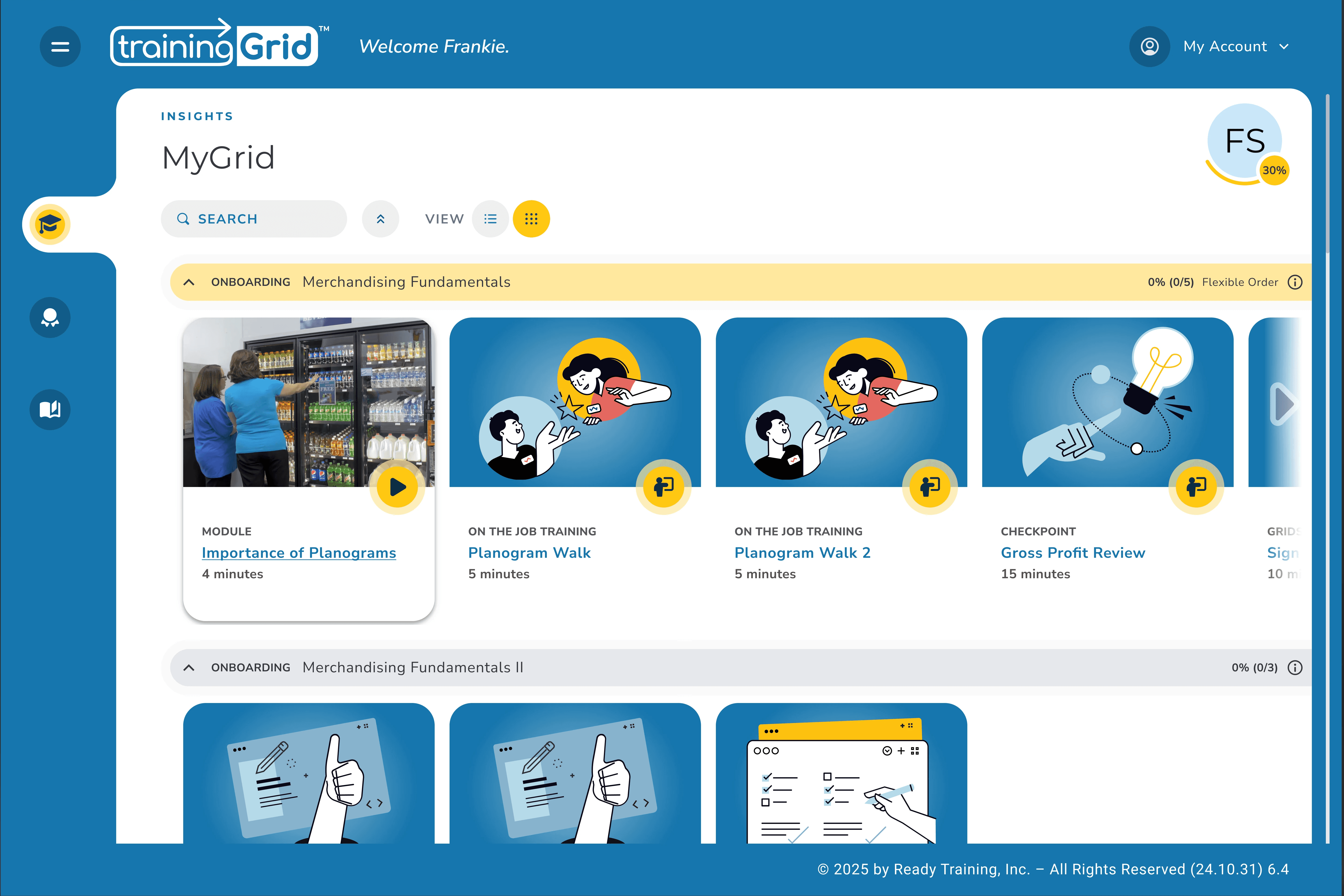
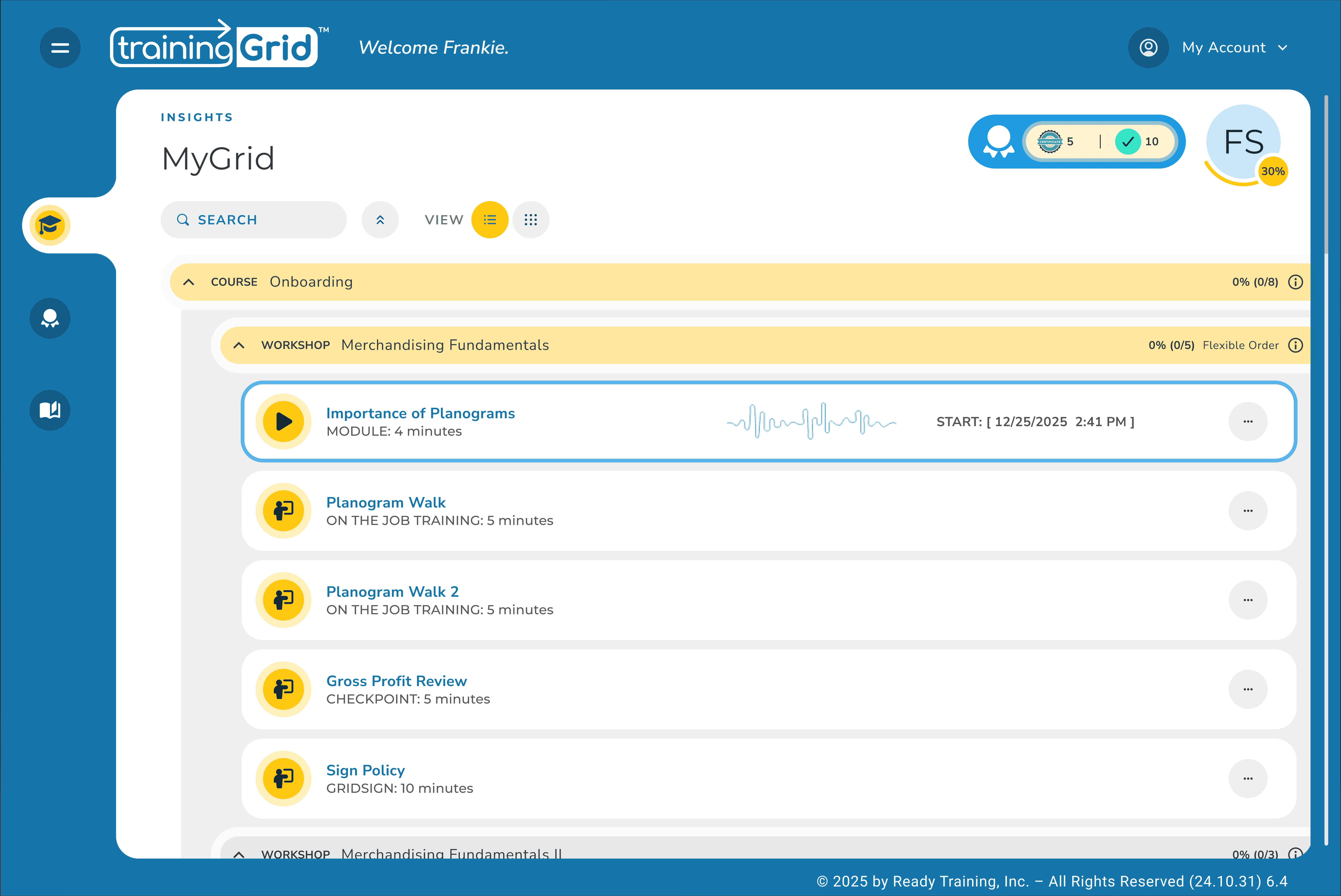
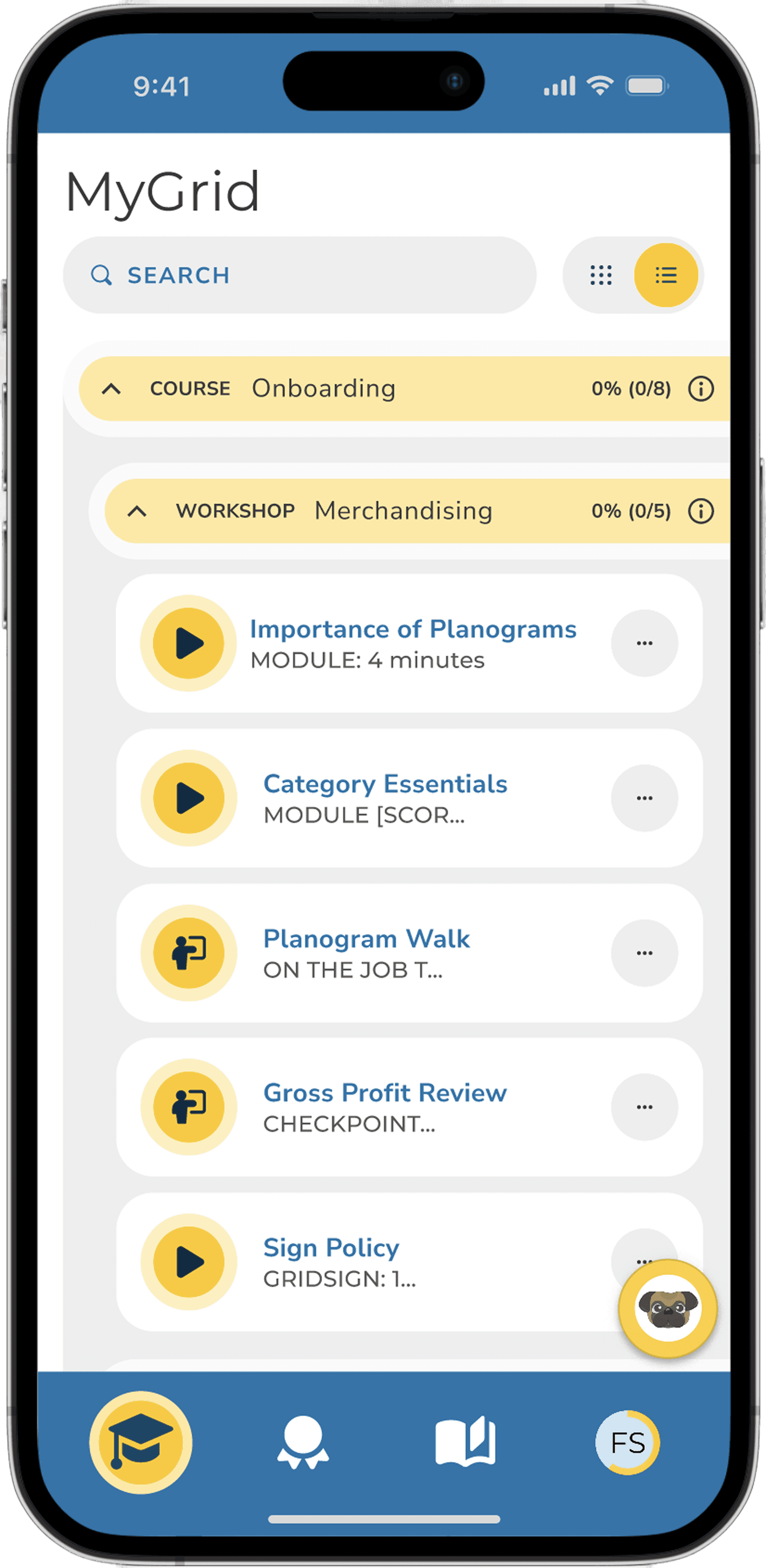
The list view is gives users a more detailed view with similar collapsible rows giving them a hierarchy of courses and workshops.
User Flow: Completing a Training Module
Outcome
Improved Usability
Design Library Growth
A scalable and functional design system that streamlined the process for designers and ensured consistency across the platform.
A polished prototype that effectively conveyed the design’s potential and secured buy-in from key stakeholders.
At the National Assn. of Convenience Stores (NACS), received high praise for the new intuitive design and aesthetic.
- Customer Advisory Group has stated that trainingGrid will be much more competitive in the marketplace.
- Usability testing is about to begin where we get user satisfaction ratings. Stay tuned!